Interrupting Chicken with happy surprises

There were some favorite books and happy surprises for me among the ALA Award winners on Monday.  The best was David Ezra Stein's Caldecott Honor for Interrupting Chicken (Candlewick).  It was on my list!  It was my six-year-old daughter Milly's most favorite book last year, too.  According to the copyright page, the illustrations were done in a unique combination of watercolor, water-soluble crayon, china marker, pen, opaque white ink, and tea.  They results are gorgeous--the glowing colors and painterly technique used for the little red chicken and her Papa in the main story contrast beautifully with the more old-fashioned looking pen drawings used for the stories-within-the-story (Hansel and Gretel, Little Red Riding Hood, and Chicken Little).  And then there's Bedtime for Papa, illustrated by the little red chicken herself (she seems to use only crayon).  A classic.

I was also happy to see Margarita Engle recognized with a Pura Belpre Author Honor for The Firefly Letters: A Suffragette's Journey to Cuba.  This is my favorite of Engle's verse novels (so far); I wrote about it here, quoting a passage about the Santa Lucia celebration in Sweden and its connection to the fireflies in the title (and on the cover).  Engle's Hurricane Dancers: The First Caribbean Pirate Shipwreck (Henry Holt) will be out in March.

And finally, Tomie dePaola won the Laura Ingalls Wilder Award for his "substantial and lasting contribution to children's literature."  I love Tomie de Paola, especially at Christmastime (it's his favorite holiday, too!), and was already happy that last year's Joy to the World: Tomie's Christmas Stories (Putnam Juvenile) includes The Story of the Three Wise Kings, which has long been out of print.  Now if only Pages of Music (written by Tony Johnston, illustrated by Tomie) and An Early American Christmas were in there, it would be perfect.

What were your happy surprises on the ALA Awards list?  Or (unhappily)...off of it?  I have some of those, too.

2011 Caldecott Hopefuls

I'm posting my list of Caldecott Hopefuls (I don't even try to pick the winners; these are just some of last year's personal favorites) from a borrowed computer on our last night in London.  Sadly, I scheduled our plane trip home such that we will be IN THE AIR when the ALA awards are announced tomorrow morning.  It's going to be a long flight!

Nonfiction edition (links are to my reviews of these titles):

International edition (I know, not eligible, but these are MY Caldecott Hopefuls after all):

  • The Quiet Book by Deborah Underwood and Renata Liwska (Houghton Mifflin).

And that's it, except for the ones on my desk at home that I'm forgetting.  Maybe the Caldecott Committee will remind me, or maybe they'll choose Art and Max by David Weisner (Clarion):  a worthy choice!  What are your personal favorites and/or Caldecott picks?  Remind me.


Caldecott hopefuls: Big Red Lollipop

[I should note that by "Caldecott hopefuls" I mean picture books I happen to like a lot, not necessarily picture books that are likely to be recognized by that committee using these criteria (although one can hope).   Really, I'm almost always surprised by the Caldecott (well, maybe not last year, when The Lion and the Mouse won).  But for what they're worth, here are my quick takes on some 2010 favorites, starting with Big Red Lollipop.

In Big Red Lollipop by Rukhsana Khan, illustrated by Sophie Blackall (Viking), Rubina is invited to a birthday party and her mom, unfamiliar with the whole concept of birthday parties, insists that her little sister Sana attend the party, too.  Sana is a brat at the party and then eats the lollipop from Rubina's goody bag ("I don't get any invitations for a really long time," says Rubina).  When Sana gets a birthday party invitiation, should littlest sister Maryam get to go?

I should probably admit that I'm the bratty little sister in my family (hi, Maria!), so I speak from experience when I say that both Khan's text and Blackall's illustrations get the sibling and cultural dynamics just right.  It's the expressive faces and easily readable body language of the sisters (and their mother) that tell the real story here.  A spare, creamy background sets off the composition of the illustrations as well as the colors and patterns of the family's clothing. 

Blackall did the cover art for last year's Newbery winner, When You Reach Me (written by Rebecca Stead; Wendy Lamb Books, 2009).  The first page of Big Red Lollipop (shown below) recalls that image, but it's the bird's-eye views--particularly the one of Rubina chasing Sana around the first floor of the house--that are really striking.  A graceful and gorgeous book.

Bones by Steve Jenkins: Not just for Halloween!

Children's book author and illustrator Steve Jenkins sets the standard for cut paper collage illustration in every one of his books (What Do You Do With a Tail Like This?, made in collaboration with Robin Page, won a Caldecott Honor in 2004).  His newest nonfiction book is Bones: Skeletons and How They Work (Scholastic, 2010).  You might think that bones, being mostly white, would be less interesting visually than the range of fins, fur, and feathers rendered in the rest of Jenkins's books about the animal kingdom (I might have, anyway); on the contrary, Bones is Jenkins at his best.

The bones themselves, cut from a limited palette of mottled creams and grays, glow against the solid background colors, but the best part is the arrangement of bones on the page, to inviting, eye-opening, often humorous effect (the gatefolded human skeleton waving at you is just one example).  Jenkins's background in graphic design really shows here.  Witty headings and compact text plus a More About Bones section at the back round out the book.

Bonus:  Add up the number of bones in the human body as you read; you should end up with Jenkins's total (which would be...?).

[Nonfiction Monday is at Mother Reader today.  Thanks, Pam!]

Lauren Child, Charlie and Lola in Slightly Invisible

For fans of Lauren Child's Charlie and Lola:  The Guardian profiles Lauren as part of their "A life in..." series ("Lauren Child: A life in books," 10/04/2010), accompanied by a gallery of images from Slightly Invisible, her new Charlie and Lola book.  I like all of Lauren Child's work, but I'm partial to Charlie and Lola because they remind me of my own kids, who when they were small would insist that I substitute their names when reading aloud.

I especially like Child's portrayal of Charlie and Lola's sibling relationship.  Charlie in particular is consistently patient with and protective of Lola, both qualities I try to encourage in my own son.  So I wasn't sure what to think when I read that Slightly Invisible, the first new Charlie and Lola book since 2003 (not counting all those spin-offs from the BBC series), was inspired by a boy who asked, "Have you ever thought about writing a book where Charlie actually gets annoyed with Lola?"  No!

Anyway, I'm looking forward to Slightly Invisible (and my son will probably love it).  This image is from the beginning of the book: there's poor Charlie, caught between Marvin's eyerolling and Lola's plaintive look.  The whole scene is instantly recognizable.

Slightly Invisible won't be available in the US til May 2011, but I plan to pick up a copy when we're in London later this year (happy birthday to me!).   A traveling exhibition of Green Drops and Moonsquirters: The Utterly Imaginative World of Lauren Child will be at the Discover Children's Story Centre while we're there, too.

Dave the Potter

I'm looking forward to Dave the Potter by Laban Carrick Hill; illustrated by Bryan Collier (Little, Brown, 2010), and reviewed in today's Shelf Awareness (9/15/2010).  Dave was a 19th-century potter and poet from South Carolina, where he was enslaved for most of his life.  He inscribed some of his pottery with two-line poems, practical ("put every bit all between / surely this jar will hold 14," indicating that the jar would hold 14 gallons) as well as personal ("I wonder where is all my relation / friendship to all--and, every nation").  In any case, reading and writing, even signing his name (which he also did, in beautiful script, "Dave") was forbidden to slaves, making Dave the Potter's work even more powerful and rare.

Hill's text, fittingly, is also a poem about making a pot, crafted of short, strong lines; Bryan Collier's earth-toned watercolor and collage illustrations provide the larger context (the pairing is described in Brown's review as "a glorious collaboration").  The back matter is thorough and includes some of Dave's poems (I quoted my favorites from them) as well as photographs of his work.  You can even peek inside Dave the Potter using BookBrowse.

Grownups like me who want to know more about Dave should try Carolina Clay: The Life and Legend of Slave Potter Dave by Leonard Todd (Norton, 2008).  Todd is a descendant of one of Dave's owners; he began his research after finding out about his family's connection to Dave in this New York Times article ("In a slave's pottery, a saga of courage and beauty," 1/30/2000).  Finally, local folk can see an alkaline-glazed stoneware jar made by Dave the Potter in 1862, on display in the Civil War collection at the National Museum of American History in Washington, DC.

How the Sphinx Got to the Museum, review and giveaway

Most of us only get to see Ancient Egyptian artifacts in museums far from Egypt--like the Metropolitan Museum of Art in New York City, which has one of the finest collections of Egyptian art outside of Cairo.  And while there are lots of books for kids about Ancient Egypt, this book answers the question that at least one kid on every school tour is likely to ask:  How the Sphinx Got to the Museum by Jessie Hartland (Blue Apple Books, 2010).

Hartland uses the school tour to frame the story of the Sphinx of Hateshepsut's journey over 3,000 years (and 5,000 miles), from the quarry at Aswan where the granite was obtained all the way to the galleries of the Met.  The cumulative story format--think The House that Jack Built--introduces some of the people and professions involved in her journey; on the museum side, those include archaeologists, art movers, curators, conservators, even the registrar, who uses "red oil paint and a teeny, tiny brush" to paint the the official number (31.3.166) on the Sphinx.

These vignettes are fascinating (trust me, kids ask about this sort of thing all the time).  Hartland varies the repetitive parts of the text just enough to keep things interesting; the use of a variety of fonts also helps here.  The ink-and-watercolor illustrations themselves are worth the price of admission, though:  colorful, detailed but not busy, expressive and entertaining (keep an eye on the Sphinx's face throughout).  Hartland worked closely with the staff at the Met, and the book has an authentic museum feel.  N.b., the docent is wearing sensible shoes.

I have an extra copy of How the Sphinx Got to the Museum to give away!  If you'd like to be entered in a random drawing (and you do; it's a gorgeous book), please leave a comment by midnight Monday, September 13.   Bonus entry if you comment with a behind-the-scenes-at-the-museum question you'd like to see answered in picture book form.

[Review copy from Blue Apple Books via Media Masters Publicity.  Thank you!]

Hansel and Gretel, costume design by Zwerger and Stemple

The costume and set design for the Amherst Ballet's Hansel and Gretel is faithful to Lisbeth Zwerger's watercolor illustrations of the Grimm tale, "right down to the shingles on the witch’s house [and] the patterns hand-printed on the dancers’ skirts" (Shop Talk, 8/25/2010).   If you know me at all, you'll know that I love this project.  Premiering at the Eric Carle Museum of Picture Book Art.

Ballet for Martha

Sometimes art is made by one artist, working alone, but sometimes it is the result of artists working together--collaborating--to forge something new.

At this point, I'm just adding my voice to the chorus of praise (including five starred reviews) for Jan Greenberg and Sandra Jordan's latest collaboration, the picture book Ballet for Martha:  Making Appalachian Spring (illustrated by Brian Floca; Roaring Brook, 2010).  Actually, authors Greenberg and Jordan (Action Jackson, 2002; Christo and Jean-Claude: Through the Gates and Beyond, 2008) also collaborated with Floca and editor Neal Porter (not to mention book designer Jennifer Browne) to an unusual degree in the making of this book; see Booklist's Story Behind the Story (June, 2010) for their process.

Back to the book itself, which is about the collaboration of choreographer Martha Graham, composer Aaron Copland, and artist Isamu Noguchi in the making of Appalachian Spring (link is to a filmed version from 1959; the first performance was on October 30, 1944 at the Library of Congress).  Somehow Ballet for Martha beautifully conveys a Graham-like sense of movement, music, and spaciousness; all qualities that would seem to resist the book form.  It's in the spareness of the text, and the line of the illustrations.  And--a point that has not yet been made, I don't think--it's a book about ballet that's not pink.  No tutu required.

I did wonder who had designed the costumes (Martha Graham herself); an original cast member was able to describe the colors to Floca.  I should note that in the final image, of an imagined performance, the Bride is wearing a pink dress!  It must have been impossible to resist.  The back matter ("Curtain Call") includes brief biographies of Graham, Copland, and Noguchi, each accompanied by a photograph of the artist dating to the 1940s; as well as extensive source notes and bibliography.

Ballet for Martha is a masterpiece--both of them.  Don't miss it!

Urban Animals

No,  not pigeons, rats, or raccoons.  Urban Animals by Isabel Hill (Star Bright Books, 2009) is about animals in architecture, and it works as an introduction to architectural terms (like keystone, column, and bracket), as well as an I Spy book that might inspire you and your kids to look for the animals in your own built environment (or in a nearby city; author and photographer Isabel Hill found all of these animals in New York).

I like the design details of Urban Animals itself:  Colorful cartoon animals correspond to the mostly monochrome architectural ones, and coordinating accents (photo corners on the detail shots, the hand-printed font used for architectural terms) brighten things up.  The rhyming text (it's all in couplets) is relatively utilitarian.  Here's a typical double-page spread:

There's also an Architectural Glossary at the back of the book, helpfully keyed to a line drawing of a city block; and a list of "Animal Habitats" that gives the NYC street address (as well as the architects and construction dates) of the buildings featured in the book.

It's interesting to think about why a particular animal might have been incorporated into a building's design:  the cow on the Sheffield Farms Milk Plant makes sense, and so does my favorite, the squirrel on the Kings County Savings Bank, but what about the alligator on Liberty Tower?

[Local folks, check out the National Building Museum's Calendar of Events for animal sightings in Washington, DC.  I'll let you know if we spot any more!]

BraveMouse Books: Benjamin and Bumper to the Rescue

When Benjamin Middlemouse's mother goes missing from their home in the armoire, Benjamin and his friend Bumper (a small elephant who lives on the bed) go on a search-and-rescue mission that takes them into the kitchen, out to the garden...and straight up the stairs to Sir Pouncelot's tower.  Will they free Mrs. Middlemouse from her cage before Sir Pouncelot (ha!) bakes her into a casserole?  Well, yes, but how they do it--and make him promise never to eat mice (or moles) again in the bargain--is part of the homespun, handmade charm of Benjamin and Bumper to the Rescue by Molly Coxe, with photographs by Olivier Toppin (BraveMouse Books, 2010).

Benjamin, Bumper, Mrs. Middlemouse, and Sir Pouncelot, not to mention the miniature world they inhabit, are quite literally the creations of author Molly Coxe.  (You can make a BraveMouse like Benjamin, too!  Molly and her daughter show you how.)  They were photographed for this book by Olivier Toppin, who specializes in lighting effects that set a magical mood.  It doesn't hurt that the photos were taken in a medieval French village, either.

The interior scenes, like the one in Benjamin's bedroom (above), are filled with a combination of repurposed, miniature, and handmade items that child readers with an eye for detail will love to discover.  I especially liked the outdoor shots, too: the whole thing, from kitchen to garden, feels very French.  [A good thing!  More sample pages at BraveMouse Books.]

It's clear that great care and love have been lavished on this book, the first in the Adventures of Benjamin and Bumper series to come out of "mouse-sized" publishing company BraveMouse Books (a story in themselves).  The next book in the series, Posie and the Pirates, promises more small adventures for the BraveMice (and Bumper).  Watch out for the Roof Rats!

[N.b. Review copy provided by the publisher; thank you!]

Alphabeasties is just my type

The animals in Alphabeasties and Other Amazing Types by Sharon Werner and Sarah Forss (Blue Apple Books, 2009) are created--or composed, as in printing--of type.  There's a different typeface for each animal, from Volta EF Aaaa's for alligator to American Typewriter Zzzz's for zebra (as seen on the cover), with lots of clever combinations, like Bauhaus Dddd's for dog (it's a Dachsund, of course) in between. The result is a playful and sophisticated alphabet book that works for little kids, big kids, and their design-minded parents, too.

In a brief introduction to typefaces and to the concept of the book, Werner and Fosse ask readers to think of a word to describe each animal and consider whether that word also describes the typeface used to create it--a nice exercise in visual thinking.  My favorite match of typeface to animal might be the shaggy sheep (see below).  The typeface is Giddyup, except for a sans-serif band around the middle where the sheep has been sheared (with scissors): 

There's more witty letter-and-wordplay in the sidebars, where you'll find embroidered E's, zippered Z's, and a mouthful of T's, among multiple examples for each letter; as well as gatefolds that open horizontally or vertically to reveal the alligator's open jaws or (another favorite) the unicorn's flowing mane.  [See more interior photos at Werner Design Werks flickr; it was hard to pick!]

Ultimately, Alphabeasties reminds its readers that a b sounds like a b no matter what it looks like (little kids will appreciate that), but a Fette Fraktur B...that's a different animal.  Can you guess which one?

[N.b. Review copy provided by the publisher; thank you!  Alphabeasties is also available at the NGA Shop (that's where I saw it first).  For the littlest kids, there are Alphabeasties Flash Cards (the typeface animals are on the front of the cards; flip them over to make two floor puzzles).   And for everyone else, there's the Alphabeasties Amazing Activity Book as well.]

Life-Size Zoo

Life-Size Zoo by Teruyuki Komiya (Seven Footer Kids, 2009 for English edition) is better than a trip to the zoo.  There, I said it.  At least when it comes to seeing the animals up close, that is.  An "actual-size animal encyclopedia," Life-Size Zoo is beautifully designed (it's a Japanese import) and illustrated with vivid color photographs of 21 zoo animals.

Each animal gets a double-page spread.  Occasionally two animals share a spread that highlights their similarities and differences; prairie dog and meerkat, hedgehog and armadillo.  There are also a couple of gatefolds (giraffe, elephant, rhinoceros) and vertical layouts: it's a very interactive book.  The standard format looks like this (link is to a PDF of the tiny image below):

Here, the right-hand column gives information about the animal in the photograph (including its name! This tiger is called Baito) and more information about what you can see in the picture ("Time for a Close-Up"), as well as facts to keep in mind when you see the animal at a zoo (note: these are often poop-related).

"Time for a Close-up" is my favorite feature of Life-Size Zoo; it encourages careful looking by asking the reader to notice specific details of the photographs such as, in the case of the tiger, four huge fangs; black lips; thick whiskers on his cheeks, and a short mane all around his face.  I also love the Contents, designed to look like a zoo map, and the endpapers, which include full-body snapshots of the animals in their zoo habitats.  My kids like the little cartoons that illustrate the animal facts, too.

If you like lions or prefer penguins, check out More Life-Size Zoo and Life-Size Aquarium (May and September, 2010).  You might also want to compare Actual Size by Steve Jenkins (Houghton Mifflin, 2004), which is illustrated in his trademark cut and torn paper collage (there's a tiger in it, too).  What's the same or different about the books' content, images, and design?

[Nonfiction Monday is at the SimplyScience Blog this week.  Thanks!]

An interview with Samantha Vamos, for Dia

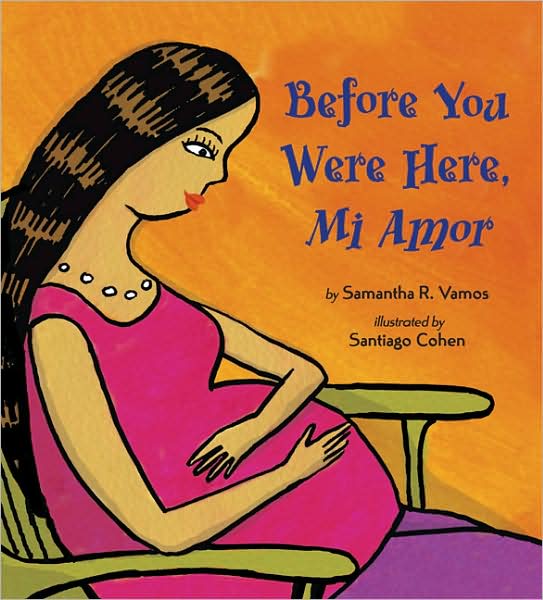
We're celebrating El día de los niños/El día de los libros (Children's Day/ Book Day) a little in advance, with an interview with children's book author Samantha Vamos.  Samantha gives us "the story behind the story" of her bilingual picture book Before You Were Here, Mi Amor (illustrated by Santiago Cohen; Viking, 2009), her forthcoming work, and the mood-altering effects of arroz con leche.

Before You Were Here, Mi Amor had a long gestation period--eleven years!  Where does its story begin?

The inspiration for Before You Were Here, Mi Amor came from the first pregnancy of my younger sister.  My extended family and I began envisioning doing things to welcome our future grandson/nephew into the world.  Those thoughts generated memories of my mother telling me about my anticipation over the birth of my younger sister.  I often asked when my sister would be here and when she would be old enough to play with me.  With those memories, I began writing and my book is an outgrowth of that experience.  Of course, my nephew took a mere nine months to birth and as you’ve noted, my book took eleven years!  

How did it evolve into a culturally-specific story about welcoming a new baby into an extended family?

As usual with my writing, there is a story behind the story.  I had written a manuscript.  Although the manuscript sold to a major publishing house, that house was subsequently acquired and my manuscript sat with no plan for publication.  Later, I received a release, permitting me to shop the manuscript again.  Years later, recognizing changing U.S. demographics and the fact that the family is a very significant element of Latin American culture, I realized that my manuscript might especially appeal if rewritten to incorporate Spanish.  I drew upon Latin/Hispanic cultural elements to write the book as well as the community and characteristics of my immediate and extended family.

I have to ask:  does eating arroz con leche really give you (or your baby) "a sweet and gentle nature"?  (I hope so!)

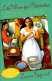
Many books have made an impression on me and Laura Esquivel’s Like Water for Chocolate is a favorite.  Esquivel’s protagonist Tita De La Garza not only expresses her emotions through food, but also nurtures with food.  My family similarly shows their love through food preparation.  When my sister was pregnant, my father often prepared delicious, healthy things for her to eat.  As I recalled his special meals, I wondered what the pregnant mother in my book could eat that would result in blessings for her baby.

Rice pudding is sweet and mild and I thought how delightful it would be if eating it would impart beneficial qualities to the baby.  Unfortunately, I can neither confirm nor deny that eating arroz con leche gives a baby a sweet and gentle nature.  I would guess, however, that an excellent bowl could improve the disposition of pregnant mothers.  [I would agree! -- AA]

The text of Before You Were Here, Mi Amor is in English, interwoven with Spanish words.  Why did you choose to write it this way?

As I incorporated Spanish words, the text flowed differently – the words sounded more intimate, more beautiful and tender.  The text resonated more with me because the bilingual manner of speaking reminded me of the way I had heard language spoken as a child.

How do Santiago Cohen's illustrations complement the text?

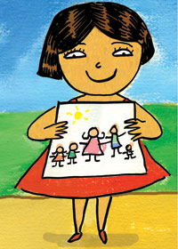
Santiago Cohen’s jewel-toned illustrations are both vibrant and charming.  The entire book is a rich, robust explosion of color – from the Dedication page to the Glossary.  Yet beyond color, I feel that Santiago’s illustrations complement the text because his paintings convey the warmth and community of family life.  One of my favorite illustrations is his picture of the hermana (“sister”) showing the drawing she’s made of the members of her family.  Framed on a wall above my son’s art table are the illustration of the family dancing salsa together (they’re joyful and I cannot help but smile) and the illustration of abuela (“grandmother”) painting an animal mural on the baby’s bedroom wall.  The two-page spread of the mother rocking, wondering what her child would be like suddenly slows the text’s pace.  Santiago painted blues and purples that soothe and calm.  He’s a very talented artist and a kind, lovely person.   

Your next book, The Cazuela That The Farm Maiden Stirred (Charlesbridge, 2011) also introduces Spanish vocabulary in an organic way.  Would you tell us a little bit about that book?

The idea for The Cazuela That the Farm Maiden Stirred popped into my head one morning while making pancakes.  Lacking two ingredients, I thought how much more fun it would be if I lived on a farm and the cow was kind enough to provide a cup of milk and the hen offered an egg.  A few minutes later, I put down my utensils and began writing.  I never finished the pancakes, but I did manage to write a first draft of my story!

The Cazuela That The Farm Maiden Stirred is a children’s picture book based on the familiar nursery rhyme, "The House That Jack Built."  Like the nursery rhyme, The Cazuela That The Farm Maiden Stirred is a cumulative tale in which the action builds as certain words repeat.  Specifically, in this case, Spanish words, which are woven throughout the English text, repeat as the story builds.  Five different farm animals (goat, cow, duck, donkey, and chicken) and their farmer each contribute ingredients to a pot (the cazuela) stirred by the farm maiden. A surprise recipe is created and at the book’s end, an actual recipe is provided.  There is also a glossary with a pronunciation guide.

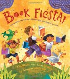
I’m thrilled to say that The Cazuela That The Farm Maiden Stirred is illustrated by Rafael López, the recipient of the 2010 Pura Belpré Illustrator Award for Book Fiesta! (Pat Mora; Rayo, 2009).  I’ve recently seen his illustrations for The Cazuela That The Farm Maiden Stirred and they are beautifully detailed and absolutely magical.  He has truly given the story life and the characters are both amusing and delightful.  I’m very grateful that we’ve been paired on this book.

I can't wait to see Cazuela!  What can you tell us about your current projects?

I recently wrote a children’s picture book about trucks, and after ten years, my novel about a widow is receiving finishing touches.  I have an idea for a non-fiction picture book that I’d like to try writing and I hope to soon return to a middle-grade novel that I began years ago.

I wish you the best of luck on your current (and future) projects, Samantha.  Thank you for sharing your stories with me at bookstogether.

[Me again.]  In Before You Were Here, Mi Amor, the siblings fill a bookcase with some of their favorite libros for the new baby.  You can find about more about Samantha Vamos, including some of her favorite books, and her work at her website, www.samanthavamos.com.

Poetry Friday: My Uncle Emily and the Buccaneers of Buzz

"One day when we were in the garden, choosing flowers for the table, my Uncle Emily gave me a dead bee and a poem for my teacher."

I was reminded of this incident with the dead bee, as reimagined by Jane Yolen in My Uncle Emily (Philomel, 2009), while writing yesterday's post about The Humblebee Hunter.  The poem in question is Emily Dickinson's "The Bumblebee's Religion--".

There are a lot of bees in Dickinson, actually; but the poem that is important to this book is Yolen's favorite, and maybe yours: "Tell all the Truth."  The book itself is beautifully written in something like free verse, and illustrated with period-appropriate style in pen-and-ink and digital media by Nancy Carpenter.  And it pairs perfectly with The Humblebee Hunter, now that I think of it.  Even the covers match!

The Humblebee Hunter by Deborah Hopkinson, for Earth Day

"One summer afternoon Mother and Cook tried to teach me to bake a honey cake."

The narrator of Deborah Hopkinson's The Humblebee Hunter, Inspired by the Life and Experiments of Charles Darwin and his Children (Hyperion, 2010) is Darwin's daughter Henrietta, or Etty.  I suppose I can't blame her for not wanting to be in the kitchen on a summer afternoon (I have a pet peeve about girls in books who are interested in science never liking needlework or cooking).  She is otherwise a wonderful narrator, at first reflective about her father and family's scientific curiosity, and then excited to take part in an experiment--counting the number of flowers a humblebee visits in one full minute--that also gets her out of the kitchen.

Deborah Hopkinson was inspired to write about Darwin's family life by a visit to the Darwin exhibit at the American Museum of Natural History (the image above is of the garden at Down House, where the experiment would have taken place) and The Humblebee Hunter, while technically historical fiction, captures what it must have been like to grow up in the Darwin household.  There's no reason (apart from scary Colony Collapse Disorder) you couldn't observe a humblebee in your own garden, though--I did, and my count was the same as Etty's!

A note about the pictures:  I always adore Jen Corace's work.  Its slight formality is perfectly suited to the period and the story of The Humblebee Hunter, as are its precise and graceful brown ink line and watercolor palette.

Read more about The Humblebee Hunter in Deborah Hopkinson's "Behind the Book" column for BookPage and her post at Wonders and Marvels (my new favorite blog, subtitled "A Community for Curious Minds who love History, its Odd Stories, and Good Reads").  And go humblebee hunting on the next sunny afternoon!  Or, if you're so inclined, bake a honey cake and read this book instead.  Highly recommended.

Registered!

I'll be attending the ALSC Preconference "Drawn to Delight:  How Picture Books Work (and Play) Today" this June at the Corcoran.  I'm not a children's librarian, but I do work with children and art in museums using the Visual Thinking Strategies that inform Megan Lambert's Whole Book Approach to picture books.  If you're wondering what VTS and WBA are all about, I highly recommend (another acronym) SLJ's two-part series on "Art in Theory and Practice" by Wendy Lukehart (1/1 and 2/1/2010).  For more information about the preconference, see below:
 
"Drawn to Delight: How Picture Books Work (and Play) Today"
Friday, June 25 from 8:00 a.m. - 6:30 p.m., Washington, D.C.

Learn to better utilize picture books in your library's programming by seeing these books through the eyes of the people who create them!  Art directors, museum educators, and award-winning illustrators will take you through the creative and collaborative journey of picture book development during this inspirational Preconference at the Corcoran Galley of Art in Washington, D.C.  Studio demonstrations, hands-on opportunities and original art door prizes are just a few of the elements that await participants.
 
Why the ALSC Preconference?

  • Provides you with a one of a kind look into the world of picture books--you won't find a more in-depth, day-long workshop on the subject anywhere else!
  • Learn from more than 15 top authors and illustrators including three Caldecott medal winners, two Caldecott honor winners and one Belpré medal winner.
  • Transfer the knowledge gained back to your library to provide better experiences for young patrons and families reading picture books.
  • Hands-on opportunities during artist-lead small group studio sessions taking place throughout the gallery.
  • Unbeatable ALSC member rate of $195 for the entire day; this includes: preconference registration, continental breakfast, lunch, evening reception, admission to the Corcoran Gallery of Art, and a chance to win original art work by the illustrators.
  • If you're not attending the ALA Annual Conference that's not a problem!  You do NOT need to register for conference to attend the preconference.

Register here
Tickets: Advance: ALA Member $249; ALSC Member $195; Retired Member $180; Student Member $180; Non-Member $280.  Onsite cost is $325 for all.
Event Code: ALS1

[Me again.]  I hope to see you there!  Along with Jerry Pinkney, Brian Selznick, David Small, Laura Vaccaro Seeger, Kadir Nelson, Yuyi Morales, and Timothy Basil Ering.  But if you can't make it, not to worry:  I'll write about it here, too.

Pinkney's Lion and the Mouse lie down with the lamb

Or rather, the antelope.  One of my favorite details of Jerry Pinkney's Caldecott Medal-winning The Lion and the Mouse (Little, Brown, 2009) is the homage to Edward Hicks's Peaceable Kingdom paintings (with Serengeti animals) on the back cover, under the dust jacket.  Pinkney discussed the influence of Hicks and other artists on his work in The Lion and the Mouse in an interview with Reading Rockets ("A playful, peaceable kingdom"). 

We have a Peaceable Kingdom at the National Gallery, and I look forward to sharing Pinkney's interpretation of the theme with visiting students alongside Hicks's.  Thank you, Mr. Pinkney, and congratulations!

[Sadly, I don't have a digital image of Pinkney's Peaceable Kingdom to post; but you'll want to peek under the dust jacket of your own copy to find it anyway.]